
My last two posts in this series are a little bit out of the ordinary, perhaps. I bought this postcard on ebay. It is very strange to say the least:

The post card has been coloured beautifully and it is interesting to note the wonderfully delicate fence, the gas light and a shrubbery that the Knights who say “Ni” would be proud of. The full set of chimneys and pinnacles are there and, back left, is Dr Dixon’s house and back right is Brincliffe School, both of which were still standing when I started in the High School in 1975. But what about all that writing?
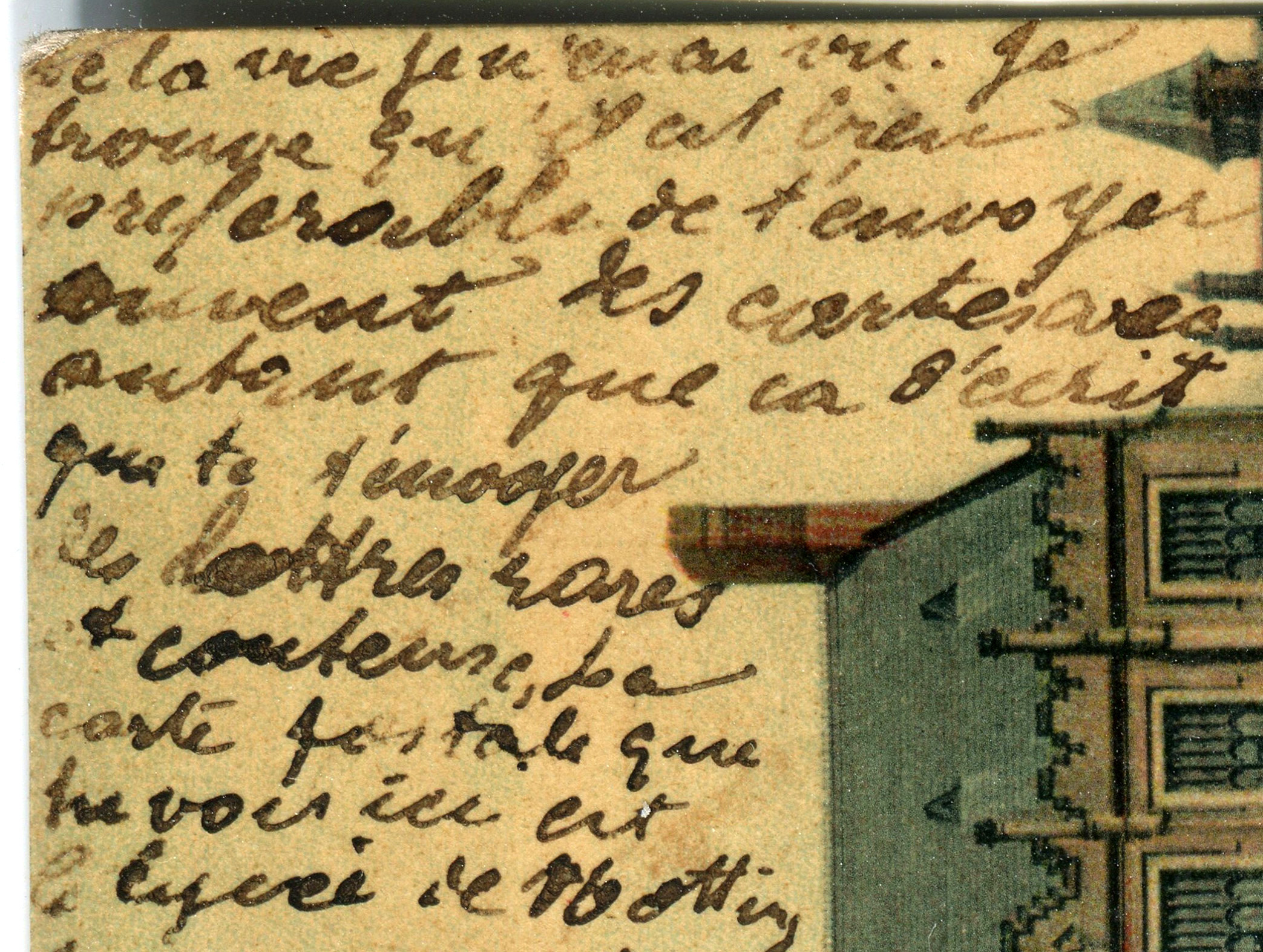
Well, I’ve spent some time working on it, and here are my enlargements, in order, from the top right to top left. Here’s No 1:
And No 2:

And No 3:
And No 4:

Why not have a go at trying to read it? Writing like this was fairly common practice in the last century. To save money, particularly money spent on mere paper, people would frequently write on it twice, once horizonally, and once vertically. That must have been a little difficult to read !


Please excuse me if I’m totally wrong, but it looks like a letter (an address at the bottom) written in French or Latin? I find these older styles of writing very hard to distinguish and, as a teacher, I’ve seen some amazing handwriting styles over the years! It’s remarkable what you can find on eBay isn’t it!
No, you are totally right! I’ve seen this kind of thing once before in Victorian correspondence in museums. They write very small and quite often write two pages of a letter one on top of another, at right angles. The words are extremely difficult to decipher, as you might imagine. You are also totally right that it is in French, which is a little unusual for a postcard from Nottingham.
After studying French since I was eleven, I can’t really make head nor tail of this. The handwriting and the faded ink are just too much for my aging eyes!
You are also correct that you find all kinds of things on ebay. The Duke of Edinburgh’s wing mirror for one, although the price was a bit much. Almost as much as Volvo spare parts!!
Oh good, that makes me feel less of a failure! It must have been so hard for the recipient to read too, if they were writing one on top of the other, how on Earth any messages got through fully understood is beyond me! I wonder if it was someone who was French, or had French connections in some way? Whatever the answer, as a piece of history it is interesting! I had heard that bits of broken glass from the Duke’s car were on eBay, what are some people like! I’ve got some old boxes and used tea bags, the Queen used them when she visited me here at home, perhaps someone would like to start the bidding at say, £300?
I honestly think you’d get good money for the Queen’s tea bag. They have sold Sir Alex Ferguson’s discarded chewing gum, after all!
Really! Good grief! Whatever next!
French, I’d say. Amazing find
It is indeed French, Derrick, although I must confess that I can’t read it any more than just the odd words or the occasional phrase. People must have had better eyesight in the nineteenth century!
I agree with Derrick!
You are absolutely right. It is indeed French and I just wish that I could decipher it!
I imagine that there is a linguistic expert somewhere that could help!
I’m going to try and get this translated, because I think it’s French.
You are quite right, it is French, but an almost illegible script. I always manage just two or three words before I reach something I just cannot decipher at all. In actual fact, the main reason I bought the postcard is the view of the school which is so beautifully coloured, presumably by hand, as there were no computers back then. I have never seen a coloured view of the school in the nineteenth century before.
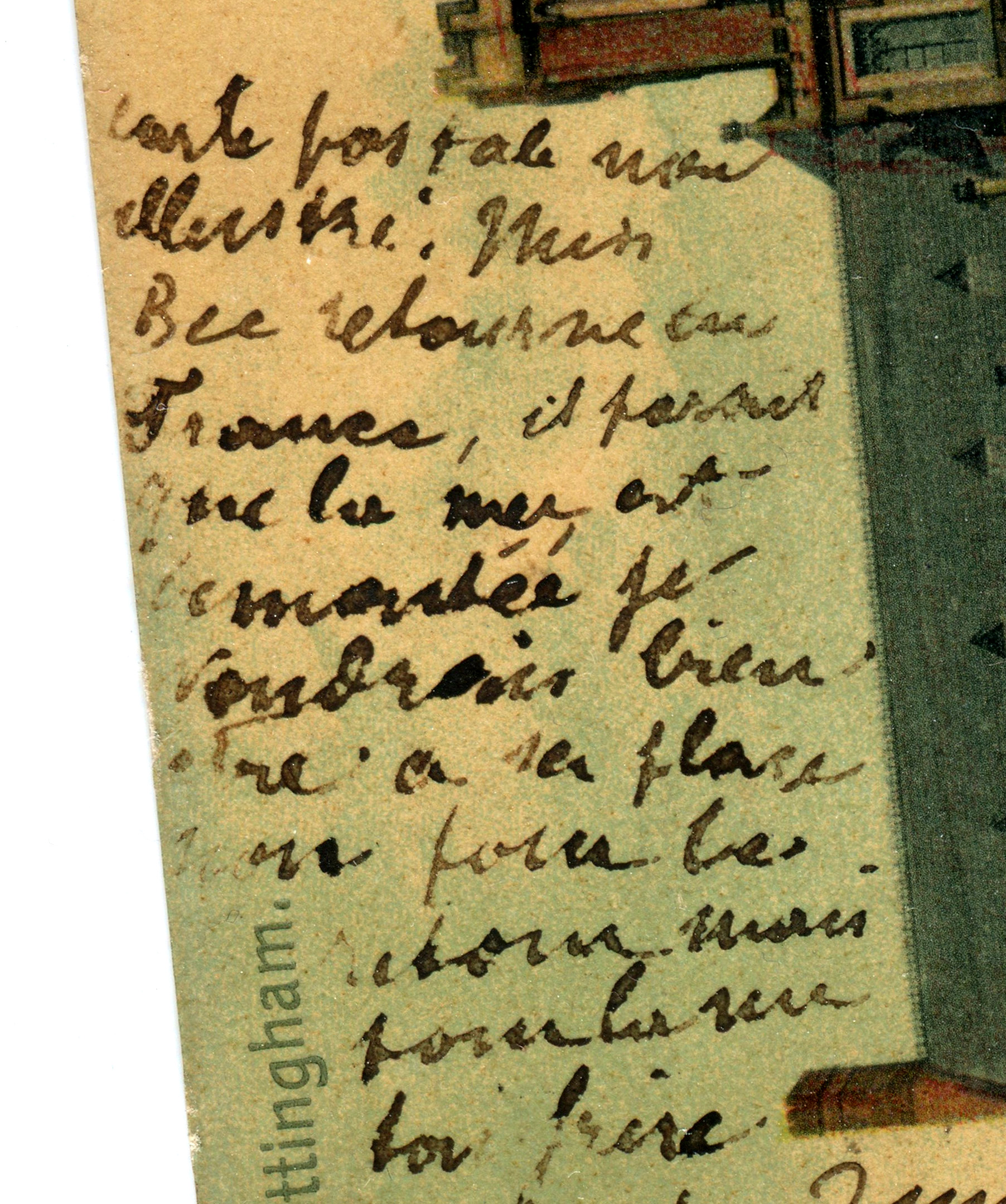
Definitely French. The address at the bottom, 3 Willoughby Crescent West Bridgford, is that of the sender, Henri M. It looks as though the text continues from the other side. The first section is saying that it is better to send the recipient open missives on a post card rather than rare, and costly, (sealed) letters. Then it identifies the scene as the ‘lycee de Nottingham’. After that it has defeated my 70 yo eyes
It looks like you win the prize for the most information extracted from the most faded correspondence ever!
The address is a puzzle. There was nowhere called Willoughby Crescent in Edwardian times but a Mrs Annie Juett, a faintly French name, lived at No 3 Willoughby Avenue. Personally, I think the first line of the address is No 3 Wellington Crescent which was occupied by Mr Luther M Warburton, a warehouseman. Wellington Crescent is in West Bridgeford (sic), off Stratford Road at the back of a police station. Willoughby Avenue though, is off Lenton Boulevard near the crossroads with Derby Road.
It looks like French to me, but I recall very little of the French I learned in high school.
It is indeed French, but I found that the major problem was actually deciphering the words, because the ink is so faded and the writing style is a little peculiar.
I don’t remember too much about high school, either. Sometimes I think “What were our set books for English literature?” or even more difficult, “What room was our room? Was it W24 or M13? Where was it?”
I presume that the brain just discards material that it thinks is not needed, especially the bits which are not used any more/.
Maybe one day you could tell us a bit more about Brincliffe School, please?
Your wish is my command! Seriously though, that’s not a bad idea. I’ll try to get something done about it in the coming months. (If there is anything to say that is, but I will try)
German Sütterlinschrift knocks all other handwriting styles into a cocked hat when it comes to sheer indecipherability.
I’m not familiar with Sütterlinschrift but I’ll take your word for it. Russian handwriting is a slightly different alphabet to the printed one, but it’s never that difficult to read because every child is taught the same handwriting style, rather like in France.
French? Dont make me work that hard John. I do love that style of illustration though. Gorgeous!
Yes, Lloyd. The illustration is actually the reason I bought the card. I’d never seen a coloured postcard of the school, and I love too the very fine ironwork on the gate. All of the metalwork is now ten times thicker with a century or more’s coats of paint.
The correspondent seems to begin by saying that he ought to send letters rather than postcards with lots of confusing writing.
That was wrong! What it says is that he prefers to send postcards frequently and with as much writing as possible and rather than an occasional and rambling letter.
You’ve got a lot better eyesight than I have! I find myself picking out a phrase, understanding it and then getting completely lost the further I travel! I think the faded ink will always be the winner here. There will be a second post about the reverse of the card, and that is, perhaps, slightly easier to decipher.
Just the handwriting you need for a dictée. !
Well, the language is definitely French and since I only know a word here and there (avec = with) I have no clue what this message says. I really loved this though. I can understand why you bought it, John. There is a strong draw which I think that architecture produces. Amazing what one can find on eBay.
Yes, Amy, it is French but the faded ink has proved an insuperable barrier to understanding full sentences. The picture, though, is beautiful and whatever long forgotten person brought it all to life with colour has done an excellent job!
Why didn’t you come to me for help my friend? Vous savez que j’aurais pu vous aider.
In the first part, he writes that indeed he finds it better to send postcards. It’s better than letters that are rare and costly. It describes much more (what he could be writing in a letter about a place). The postcard is the Lycée of Nothingham which one of your readers wrote about.
Definitely French. The address at the bottom, 3 Willoughby Crescent West Bridgford, is that of the sender, Henri M. It looks as though the text continues from the other side. The first section is saying that it is better to send the recipient open missives on a post card rather than rare, and costly, (sealed) letters. Then it identifies the scene as the ‘lycee de Nottingham’. After that it has defeated my 70 yo eyes
I do apologise, Pierre. I wanted to see if any of my former pupils from the High School, who all do five years French as a minimum, had any bright ideas about the text. It does indeed continue from the other side, and a few more details will be revealed when I post it in the near future.
Parfait mon ami.
No need to apologise…