
Dr Sheldon Cooper is famous for his series of podcasts “Fun with Flags”:

I have always enjoyed vexillology enormously but I would have to confess to an even greater love for heraldry, the study of coats of arms. I don’t really have the time to launch “Hilarity with Heraldry” in any great depth, but I don’t think anybody would find it particularly boring to take a brief look back at some old football, or soccer, badges.
I used to read a comic called “Tiger” when I was a boy and in one issue they sowed the seeds of my interest when they gave away, free, an album of football club badges. This was on an unknown date in 1961, so we are looking back quite a long way. Here’s the album:
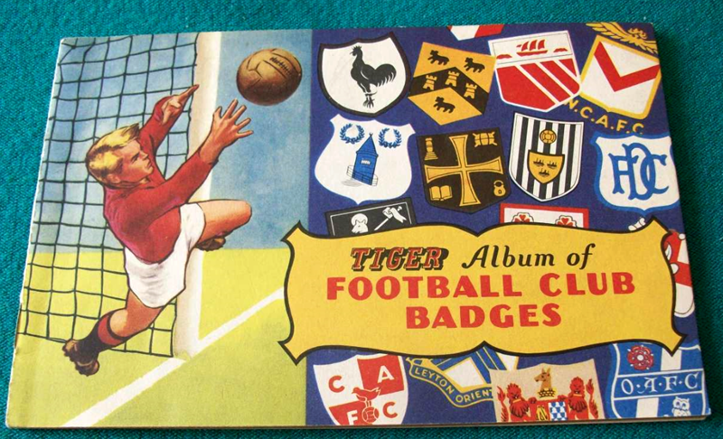
The picture comes from ebay where the albums can sell for quite good prices. So too do the 1967 versions of the album, entitled “Roy Race’s Album of Football Club Badges” in honour of the fictional star of the fictional Melchester Rovers. Roy Race was Tiger comic’s “Roy of the Rovers”:

In both 1961 and 1967 the buyer was given the booklet and then in the succeeding weeks, he received sheets of paper with around 30 small badges printed on them. He then had to cut out the badges carefully and then stick them in the booklet with extreme care and glue.
Most boys couldn’t do this, which makes it extremely difficult to buy a booklet where they are stuck in straight, and are not over-trimmed, or, in some cases, they are not stuck in upside down.
This album has a pretty good start to page one. although there is a slight crease:

This is average:

I would not buy this. They are crooked and cut out wrongly. At least two are in the wrong position:

These three are shockers:

And these two badges below are simply the wrong way round. Blackpool is a seaside holiday town with seagulls and BW may conceivably stand for “Bolton Wanderers”. And if this page is like that, the other ones will all be of a similar quality:

I was at an indoor market a few years ago when I bought several colour pages of football, cricket and rugby club badges which dated from the 1950s. The badges seemed to divide into four groups. The first were obviously based on the coat of arms of the town which the club represented. This is Notts County with the tree from Sherwood Forest. Whoever or whatever holds the shield up is called the “supporters” and Notts County have the normal two, namely a lion and some other unknown mammal, possibly on otter, or perhaps a weasel. On top of the shield is the “crest” which, in this case, is a tower from Nottingham Castle. “On top of the shield” is just an optical illusion. The crest actually used to rest on top of the knight’s helmet, so a tower is, to say the least, a challenging choice for his neck muscles. The only bit of the helmet that you can see is the padding between the tower and the metal helmet, which is yellow and green and is called the “wreath” or, because it is twisted, the “torse”:

This is Nottingham Forest with the same type of thing. The supporters are stags and on the shield is a green rustic type cross with three crowns that I know nothing about, I’m afraid.
 A similar badge was used for the Nottinghamshire cricket team:

In heraldry, what we would call colours, or tinctures to use the technical phrase, are divided into two groups. The first group is called ‘colours’ and the second is called ‘metals’. All of them have Norman French names. The metals are ‘or’ and ‘argent’, which are ‘gold’ and ‘silver’. The colours are red or ‘gules’ which comes from the word for the mouth of an animal, “la gueule”. ‘Azur’ is easy as it obviously comes from azure blue. ‘Vert’ is green and it has survived a thousand years into modern French, much like ‘purpure’ which is actually a very rare colour. ‘Sable’ is black and comes from the fur for coats, It’s a sort of rich man’s ferret, apparently:
There is just one rule about all these tinctures. Colours cannot go on top of colours and metals cannot go on top of metals. This is because Heraldry was designed for the purposes of identification in battle so everything has to be exceptionally obvious and visible. Here’s the somewhat over dressed queue for the fish and chip shop after a hard day’s peasant slaughtering:


I wouldn’t buy any of them – I couldn’t see Leicester City.
It would certainly have been in there but probably the oldest one you could think of as this was 1961. I was also bound by the fact that I had to pick the page to make a particular point such as “Blackpool is a seaside holiday town with seagulls” which not everybody would know.
In 1961 Leicester had the fox head and the crossed riding crops behind
On the same idea as our old baseball cards – today they can be worth a lot of money too.
Yes, I think that there is quite an urge to collect things among young boys. At various times I collected stamps, gum cards of many different types, football programmes and comic books which were stacked around my bedroom, much to my mother’s delight. She also enjoyed the completed plastic aircraft kits dangling on cotton from the ceiling.
We never had anything like that. Not that I remember anyway.
I suppose it depends on the geography of Australia. In England we have five divisions of twenty or so football clubs, all of which are national divisions. At the same time, all of the teams in them are at most, three hundred miles apart. That makes it possible to promote anything to do with a hundred different football clubs to the entire nation, all of whom will be interested, because their local team may be in it.
In Australia, there were, perhaps, only five states in the national competition, so similar promotions were not quite as easy. A boy living in Western Australia may not have been bothered at all about cricket in Queensland. I suppose ultimately that may have been what made the national team so important and therefore, so strong.
There was no football played interstate when I was a kid. Today there is the Sheffield Shield played for interstate cricket and there would be only a couple of thousand at each match. The ‘big bash’ 20/20 cricket abomination is becoming popular. Aussie Rules football has 18 teams most of which are Melbourne based. Most towns have their own league and a lot of interclub sport is played in rural areas. But many Australians are Man United or Arsenal etc etc fans.
As a kid I lived too far away to take notice of any sport because we had no TV, limited Radio and no sporting clubs within cooee.
I vaguely remember Tiger – possibly came a bit later than my comic reading.
I think Tiger became particularly popular in the early 1960s when the main character was the footballer “Roy of the Rovers”, who eventually seems to have dominated the comic entirely.
This website will provide all of the gory details:
https://en.wikipedia.org/wiki/Tiger_(Fleetway)
Thanks, John. I was 18 in 1960 – and a rugby man anyway 🙂
The Notts County badge from the 1950s is a new one to my eyes. It appears to be a rather poorly executed adaptation of Nottinghamshire County Council’s achievement – not granted until as late as 1937.
One wonders if the graphic artist was under pressure to provide something for The Magpies and cobbled together a design that the club never actually used.
Major League baseball has always struck me as having the strongest sporting graphic imagery/tradition. Many teams turn out in home/road uniforms that are fundamentally unchanged (slight exaggeration perhaps) for the best part of a hundred years.
The idea of the Yankees sullying their pinstripes with a Chinese bookmaker’s logo is beyond unthinkable.
No, I must admit, I don’t think that I have ever seen that particular badge either. I was immediately drawn to the animal on the right who would make a wonderful matchday character such as “Freddie the Ferret” or “Ollie the Otter” perhaps.
At one time, Barcelona did not wear sponsors’ names on their shirts but they have them now as far as I am aware.
I certainly can’t think of a team who don’t have a sponsor name, although, having said that, in my wanderings through the various satellite channels over the last couple of weeks I am sure that I saw a game where a top team like Bayern or Liverpool did not have a sponsor on their shirts. I just wish I could remember who it was.
I’m not a football fan but the Nottingham Forest badge immediately recalled the Nottingham City Council arms, which we used to see all the time on the front of the old cream and green buses!
I am not sure if I have mentioned this heraldic resource previously, but here it is anyway.
https://archive.org/details/bookofpublicarms00foxd/page/566
Thanks a lot for that link. I have an old dusty book by Fox-Davies but nothing as swish as anything computerised.
I was gratified on that link to see that the High School birds are not described as “merles” but as “blackbirds”. I have written blog posts about the Mellers’ coat of arms, and Dame Agnes’ relationship with Thomas a Becket. The same argument also appears in my history of NHS.
The problem is, though, that everybody is so brainwashed that the birds are merles that I feel a little like Cassandra who was fated ever to foretell the truth but nobody would ever believe her.
Many thanks for explaining the origin of the term ‘gules’ for red. The origins of the others, e.g. ‘vert’ for green, were obvious but I could never see how ‘rouge’ got to ‘gules’ – though my knowledge of Norman French is not exactly extensive. We live and learn!
I would be the first to admit that my knowledge of Ye Olde Frenche is little better either. I did opt to study it at university but at the first supervision I realised that, in keeping with their method of doing things, they expected you to know it all before you studied it. That in turn meant that they did not have to sully themselves with anything as terrible as teaching.
And so I quit Medieval French and went over to something else..
Crests are certainly an interesting area. I’ve always thought that unless there was a clear and direct link to a significant ‘local’ feature (tree, castle etc) that most of these things were made up. Many knights of old taking lions and eagles for their bravery and ferocity to make their wearers appear to be more significant than they actually were. Some football team crests do seem a little vague though. The gauntlet has been thrown my liege!
You are correct that local features can make their way into heraldic badges, but there are other things as well. This might include local animals or birds such as the seagull for Blackpool. It might have a link with the local big-wigs. I used to follow Gresley Rovers whose badge was taken from the one of the Gresley family. Sir Nigel Gresley used to design steam trains.
Sometimes there are even visual puns. The borough of Sandwell could have used a shield showing some sand and a well. A future blog post will contain some of these.
I suppose the more modern a badge is, the more the designers struggle to come up with anything, because all the good ones have been taken! Sandwell, by the way, have a stunning badge which is six squares arranged in a pattern presumably of great significance to them.
It is viewable at http://www.sandwell.gov.uk/. Tracey Emin eat your heart out!!
That’s certainly an interesting one! I wonder which bright spark either paid thousands or came up with that one. Perhaps you could have a top 100 daftest shields!
Sandwell comprises the former boroughs of (1) Oldbury, (2) Smethwick, (3) Rowley Regis, (4) Tipton, (5) Wednesbury, and (Oxford comma!) the county borough of West Bromwich (6). Towns I first became aware of from watching Shaw Taylor’s “Police 5” on ATV.
It is an area whose main asset is its wonderful people who soldier on no matter what. They certainly deserve better facilities than they have, as far as I have experienced them.
Will the Mayor, Aldermen and Burgesses of Smethwick Corporation ever forgive me for downgrading them from their proper status as a County Borough?
A municipal distinction which I remember to this day thanks to Jeff Leach and his beloved Rochdale.
To be honest, whatever their status, they are completely useless. So useless, in fact that most departments refuse even to answer the phone because they know what they will get from the locals.
My wife has been fighting them for two years or more over problems with her deceased mother’s house which they insisted was still a council house although it had been purchased in 1966 with all the paperwork to prove it.
I think personally that the six squares of their badge represent their collective six brain cells!
“There is just one rule about all these tinctures. Colours cannot go on top of colours and metals cannot go on top of metals.” … Normally. There are exceptions. For metals consider the flag of Vatican City:
For colours consider the civic arms of many British and Irish coastal cities and towns with “mounts proper” (i.e. a natural, grassy green) against an azure background representing the sea. Animals in their “proper” colours (such as grey or brown fur) might also be put against any background,
Forty years ago I thoroughly documented this point to successfully get a grassy mount on azure approved and registered by the S.C.A.’s Laurel King of Arms: https://tldrify.com/z61
Thank you very much for such a comprehensive reply to my blog post. To be honest, I don’t know much about modern heraldry.
The only thing I had ever read about colours on colours concerned a story about King Henry V’s standard bearer at Agincourt who was so brave that the king granted him “a red fretty upon a black fess” as a reward. The idea was that for centuries to come, people would see the strange combination, ask about it, and the story about the standard bearer’s bravery would be perpetuated.
That was Sir John Codrington. Before Agincourt, his arms were a plain black fesse on silver between three black lions passant. Afterwards, that black fesse became embattled counter-embattled (top and bottom edges indented like a castle wall), and “fretty gules” (that diagonal grid in red all across).; see blazon in Encyclopedia Heraldica, 1828.
I found a little article about him at https://wapleyagincourt.wordpress.com/our-local-hero/
It’s nice to see that the most recent version has been adopted as the badge of Dodington Parish Council.
Hmm. In all three cases, RED lions rather than BLACK — which is different from that heraldic blazon from 1828 (“… of the second” means of the 2nd-mentioned tincture, in this case sable/black). Perhaps the Parish Council has specifically differenced itself from the Codrington arms with this one colour change, because strictly speaking it’s not proper even for a government body to simply assume one’s beloved hero’s arms for oneself in every exact detail.
I don’t really see why you can’t approach the Parish Council at Dodington. Every parish council has a chairman and they may have a designated secretary. Perhaps they will be able to explain the colour change. It’s not beyond the realms of possibility that it may even be a simple mistake.